
Project Overview
This project involved working closely with Levi Strauss and Co. to identify a problem rooted in business goals and user needs and create an innovative and useful solution. My team and I were tasked to conduct research, identify, and solve for a problem in Levi's current in-store experience, with the goal of improving customer satisfaction and boosting product sales revenue. This was done by implementing an end-to-end design process.
Project Details:
Duration: 17 days
Team: 4 designers
My role: UI design, interviews, usability testing, content strategy, copywriting
Tools: Sketch, InVision, Illustrator, Principle
Deliverable: high-fidelity interactive prototype
The Challenge:
How can we disrupt existing retail conventions so that customers can shop confidently on their own terms?
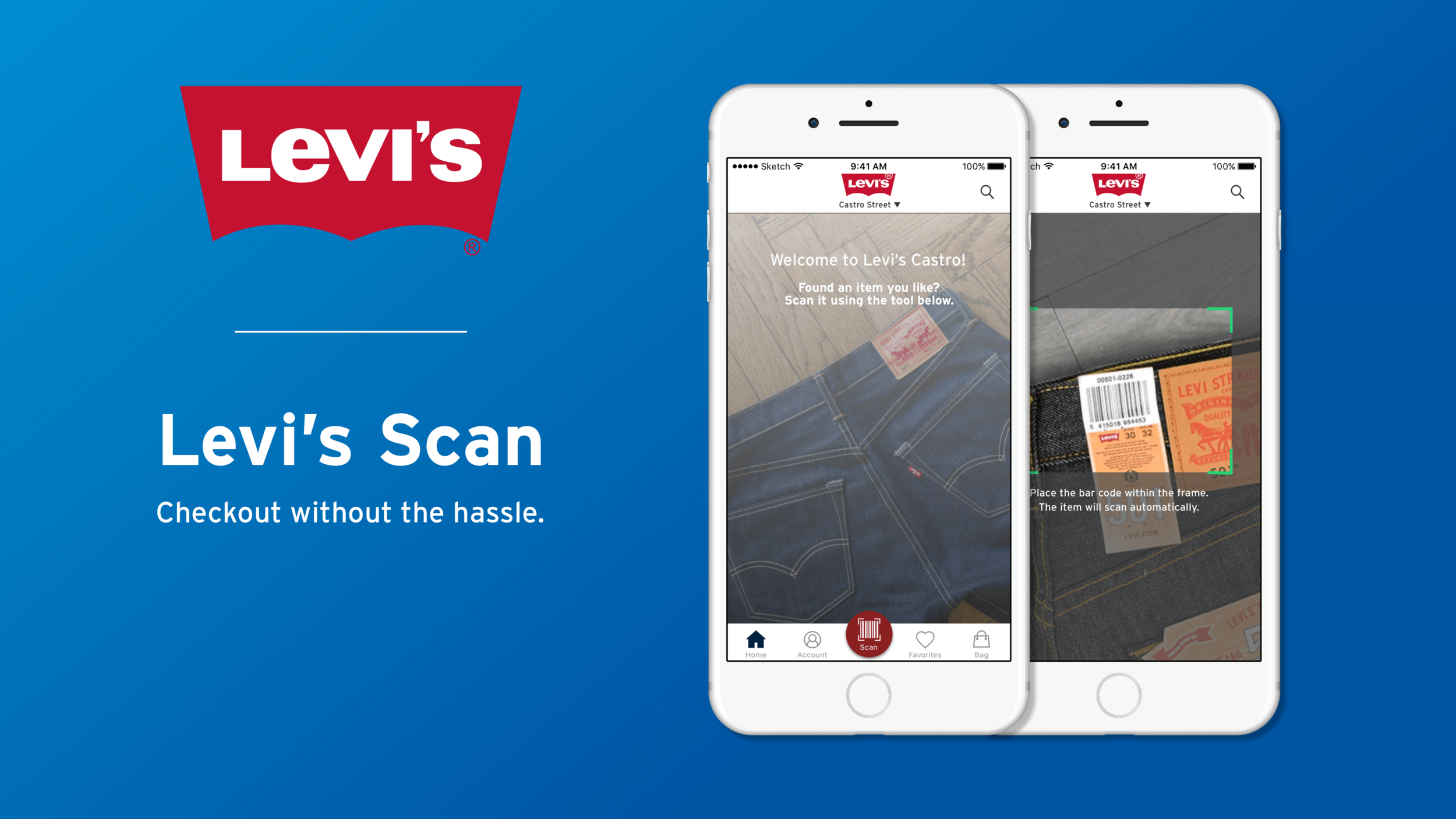
Introducing Levi's Scan.
1. Scan automatically.
2. Pay instantly.
3. Leave happy.

What I did specifically
Conducting initial interviews with store employees
Competitive analysis
Initial brainstorming through sketching and wireframing
Creating user flows
Owning design of home and checkout/payment screens
Usability testing
Content strategy, fine adjustments, and proofreading
Case Study
Site Visit
At the beginning of the project, we as a team collectively decided that the first course of action that should be taken was to visit a physical Levi's store to make observations and gain insights. A teammate and I visited Levi’s largest store in San Francisco (Market Street) to study customer and employee behavior, as well as gather information through asking questions. The goal was to obtain real-time, on-the-ground data in order to inform the design.
Key findings from this visit:
The majority of customers in this location are foreign tourists visiting for the first time who don't know their way around the store.
Checkout lines can get long during peak hours when the store is crowded.
Interviews and Surveys
Having determined that a common customer pain point was the checkout process, we took this information and endeavored to validate it further by conducting interviews and surveys. Participants expressed dissatisfaction with having to wait in line, as well as having to interact with sales associates. A total of 37 individuals took the 16-question survey, with 25-34 being the most common age. Below is a summary of all responses to five linear scale questions, with a response of 1 being "not at all enjoyable" to a response of 5 being "very enjoyable".
Survey Response Insights:
Most people have neutral experiences with cash registers
Self-checkout isn't always the most straightforward
Roving point of sale is a positive experience
People do not interact with sales associates often
Therefore, these findings led us to start thinking about taking our solution in a direction that would minimize interaction with cash registers and sales associates, as well as exploring ways to improve upon the experiences of roving point of sale and self-checkout.
Competitive Analysis
My team and I conducted a competitive analysis of other retail stores that had mobile apps to enhance the in-store shopping experience. We found that there were a number of useful features that competitors were using, including price check scanning, checkout scanning, search, saved favorites, and store map view. We decided to implement all of these features into our design. In particular, we decided to make scanning products for price check and checkout the primary feature.
User Persona
The user persona was created from the combined key findings from my team's surveys, interviews, and research. This persona is meant to represent how a typical user of the product may think and behave.
In this flow, Tyler has downloaded the app for the first time after finding a product he wants to purchase. He opens the scan tool, scans the product, pays using Apple Pay, and leaves the store.
Design Process
With the research complete, the problem clearly defined and the persona and user flow established, we started to formulate design concepts by individually brainstorming and sketching out our ideas, then reconvening to discuss what we came up with and combine our best ideas.
After sketching out a full user flow on paper, we were able to conduct preliminary user testing to get feedback. The most important pieces of feedback we received were:
Onboarding information should be displayed on the first screen
Other sizing options should be available
After each successful scan, the app should default back to the scan screen
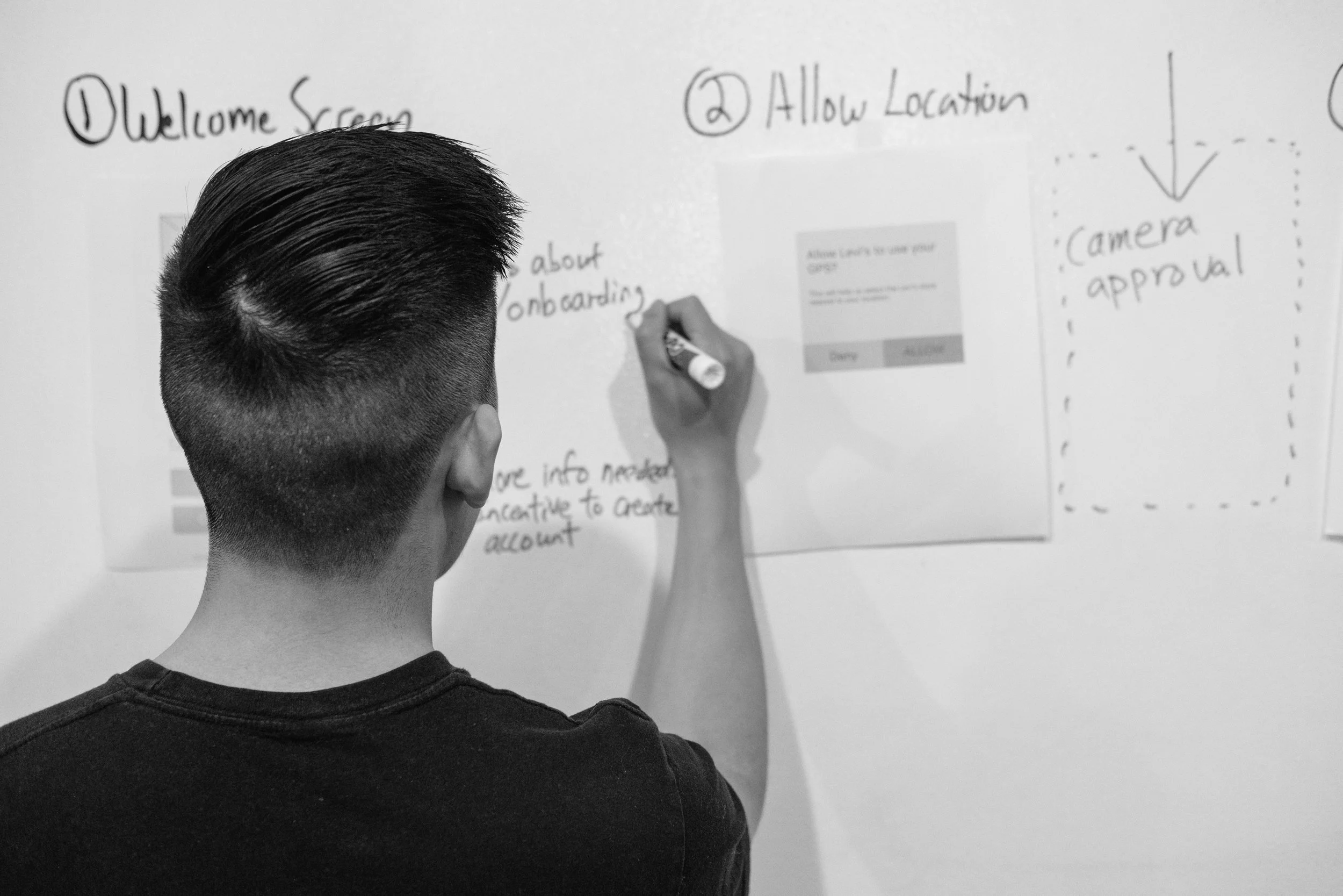
Wireframes


Taking all of the feedback received into account, my team and I resumed ideating. The following is an example of the different iterations that were created and the changes we made as a result of the noted feedback.
Feedback received and changes implemented
After mockups were created, I personally took a critical look at every screen and examined them to check spelling, alignment, padding, size, and word choice. I made improvements to maximize effective communication and logical visual choices.
Final Design

Below is a walkthrough of highlights of the final mockup, starting with a narrated full demo video.
Narrated Demo Video
Onboarding
The first thing that users will see is a carousel of concise but welcoming graphics explaining how to use the app. They are prompted to create an account, but are also presented with the options to sign in or continue as a guest.
Home Screen
Following this, the user is directed to the home page and is able to proceed with three options for courses of action: scan, search, or favorites.
Scan
If the user selects scan, they can scan their product and add it to their bag.
Store Map
If the user selects search or favorites, they will eventually be presented with a map view of the store with the exact location of their item called out.
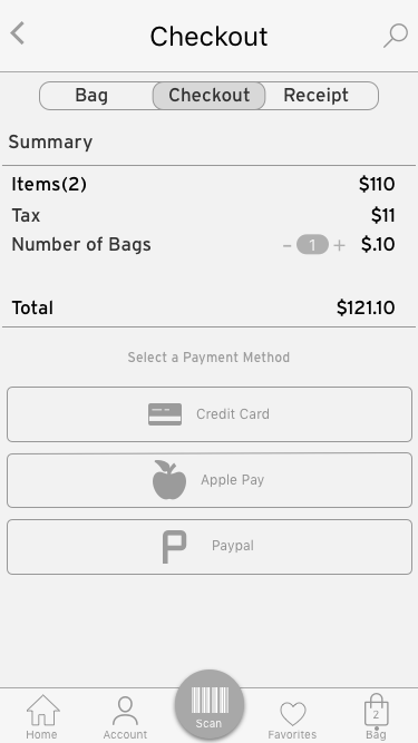
Checkout Flow
All of the user flows end with checkout. This design demonstrates how a user would check out using Apple Pay because it is likely the most convenient, but other options available are credit card and Paypal. Immediately after payment, the user is shown a receipt with their purchase summary and, if they selected a bag, a QR code for them to scan at a bag dispenser.
Next Steps
iPad Kiosks: this was an idea that my team and I initially thought about designing as a companion to the mobile app. Kiosks with iPads and scanners would be stationed throughout the store so that users who do not have the mobile app can perform the same functions using the kiosks. With the appropriate time and resources, this could be easily designed based on the mobile app.
Personalized suggestions based on shopping history: this was a piece of feedback that I heard late in the design process. Having specific suggestions based on past purchases would make future purchasing easier for the user, as well as make it feel more personal.
Returns: going beyond checkout and looking at the whole purchasing experience, another experience that my team and I considered incorporating into our design but ultimately decided to hold off on was the returns process. Returns could benefit from the scanning function in the same way that buying can.
Lessons Learned
From this experience, my main takeaway was that ambiguity is not always bad as it may seem. Our contact at Levi’s was very open about the project requirements, and did not have any specific direction for us. This was a bit daunting at first, as we were not sure how to proceed, but once we found something we were excited about, our contact was on board and very flexible and encouraging.
Another thing I learned was that some features or functions of a product that may make good sense when designing may prove to not be as appropriate to users, as we discovered several times during testing. This also underscored in my mind the importance of usability testing at every stage of the design process.
Finally, I have come to appreciate even more the value of solid research and data. At first, my team and I thought about designing a product to solve for problems with fit, like a virtual changing room app, but after gathering insights from the store visit and the survey and interviews, it became clear to us that this would not be the appropriate direction to take at the time.
Overall, I am very satisfied with the experience of working on this project, and I look forward to working on more like it in the future.